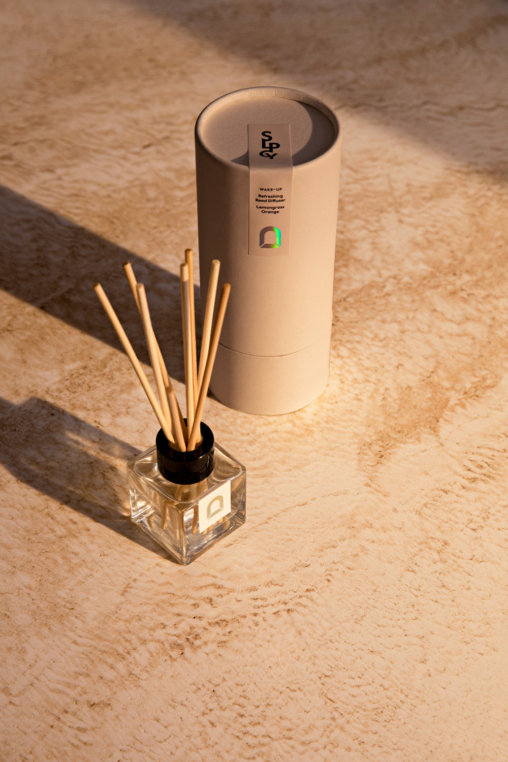
Sleepacy stands for the new benchmark of sleep quality. The name is a marriage of the word sleep and the suffix “acy” which means the state of or quality of. It’s a made-up word but with very real purpose. Content agency Edisen teamed up with us to create Sleepacy's visual identity and custom imagery. Inspired by the enormous benefits of great sleep, we developed their brand identity, logo, packaging and gifting experience that evokes the feeling of true sleep health.
Sleepacy stands for the new benchmark of sleep quality. The name is a marriage of the word sleep and the suffix “acy” which means the state of or quality of. It’s a made-up word but with very real purpose. Content agency Edisen teamed up with us to create Sleepacy's visual identity and custom imagery. Inspired by the enormous benefits of great sleep, we developed their brand identity, logo, packaging and gifting experience that evokes the feeling of true sleep health.

The Sleepacy wordmark is designed to be contemporary, iconic and premium.
The Sleepacy wordmark is designed to be contemporary, iconic and premium.

The monogram is a shortening of the full name designed in an artistic way and is used as a complement to the mainlogo.
The monogram is a shortening of the full name designed in an artistic way and is used as a complement to the main logo.
Sleepacy's arch symbol is inspired by the sun path also called the day arc that sets our time and our inner body clock, the circadian rhythm. The arch design defines sleep as the base for how we feel the active part of the day.
Sleepacy's arch symbol is inspired by the sun path also called the day arc that sets our time and our inner body clock, the circadian rhythm. The arch design defines sleep as the base for how we feel the active part of the day.


Sleepacy's palette is warm, calming and classic with a neutral off-white white and warm greige as base. Accent colors are chosen to highlight sleep technology and performance, reflecting the innovative, contemporary and scientific part of the brand. Neon yellow/glow in the dark ink is chosen as main accent, being a reference for the color of the sun and the moon that sets or time and body clock.
Sleepacys's palette is warm, calming and classic, with a neutral off-white white and warm greige as base. Accent colors are chosen to highlight sleep technology and performance, reflecting the innovative, contemporary and scientific part of the brand. Neon yellow/glow in the dark ink is chosen as main accent, being a reference for the color of the sun and the moon that sets or time and body clock.


Sleepacy Kids is the playful under-label that flirt a little with the costumer, adding charm to the brand. The Sleepacy Kids logo is designed to add a playful twist to the kids products.
Sleepacy Kids is the playful under-label that flirt a little with the costumer, adding charm to the brand. The Sleepacy Kids logo is designed to add a playful twist to the kids products.
Sleepacy Kids is the playful under-label that flirt a little with the costumer, adding charm to the brand. The Sleepacy Kids logo is designed to add a playful twist to the kids products.

Uniqlo LifewearCampaign Video

GranitBrand Identity / Rebranding

Other WorldsAI Visuals

Berluti ResortCampaign Imagery

House of DagmarAI campaign

S.Y.L.A AuctionsWebdesign / Graphic Design

Berluti Made in L.A.Campaign Imagery / SoMe Content

FjällrävenInstore signage

Fjällräven Kånken ArtCampaign idea / Motion concept

Berluti Endless SummerCampaign Imagery

Sleepacy Campaign Imagery / Visual Identity

VV CleanserPackaging Design / Campaign Imagery / SoMe Content

VV Self TestPackaging Design / Campaign Imagery / SoMe Content

UniqloSocial Media Content

Inabo SS22Campaign Imagery

Inabo BrandingBrand Identity / Packaging / Imagery

Berluti Still VeniceCampaign Imagery

FloresenceCampaign Imagery / Branding

Fjällräven KånkenCampaign Imagery

InretrnBrand Identity / Naming / Logo / Typface

VV WebsiteWebdesign

VV BrandingBrand Identity / Campaign Imagery

Carl WestinBrand Identity
Say hi!
hello@ostromstudio.com
+46 736 000 151


